Digital Brand Guidelines
The Branch Flower Shop logo, word mark, and symbol are important expressions of our brand identity. All of the brand assets have been carefully designed to achieve visual harmony at large and small sizes, and in many contexts. To make sure the Branch branding is used consistently, the brand assets should never be altered, modified, or adjusted without permission.
Logos
The logo is one of the most recognizable elements of brand identity. Consistently applied placements, clear space, and color treatments ensure the logo remains iconic in any context.
Let's get the brand out there, but get to know the rules too: no putting it upside down, stretching it, or doing anything else funky.
Use the SVG file type for the cleanest version of the file since it is in vector format and can scale without losing quality. If a PNG is used, make sure to pay attention to file size and resolution as the logo is applied.
If a single logo is needed, simply right-click the image below and select "Save As".
Download the full logos kit with the button below.
Logo Assets
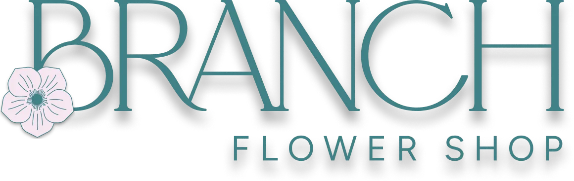
Our primary logos in the system appear simply with the logo mark and Branch Flower Shop word mark.
.svg)
.svg)
.svg)

.svg)
.svg)
.svg)
.svg)
.svg)
.svg)
.svg)

.svg)
.svg)
.svg)
.svg)
.svg)
.svg)
.svg)
.svg)
.svg)
.svg)
.svg)
.svg)
.svg)
.svg)
.svg)
.svg)
.svg)
.svg)
.svg)
.svg)
.svg)
.svg)
.svg)
.svg)
.svg)
.svg)
.svg)
.svg)
Misuse
It is important that the appearance of the logo remains consistent. It should not be reinterpreted, modified or embellished. No attempt should be made to alter the logo in any way. Below are some common mistakes to avoid.
.svg)
Skewed
Stretched vertically
Stretched horizontally
Tilted
Drop shadow
Vertical orientation
Scalability
The logos were designed and tested to work at various sizes. The minimum logo size for adequate view-ability is around 24px height. We don't recommend going smaller than this if avoidable. Establishing a minimum size helps ensure that the logo’s view-ability is never compromised.
.svg)
Smallest
Largest
Clarity
When creating a composition, it is important to have enough contrast between background and logo to maximize legibility. Below are don’ts for logo clarity.
Dark on dark
.svg)
Light on light
Colors
Our main palette uses the following colors to help bring a unique identity to your brand. The color are used in logical ways throughout the brand to guide users and create the emotional connection Branch Flower Shop is after.
Branch Dark is slightly green. We never use "true black" in the brand. This keeps even the darkest text uniquely Branch and paired well with the other colors in the palette.
Use the HEX/RGB values on anything digital.
If the brand is being printed, it will depend on the printers color profile settings, but you can refer to the CMYK values as needed. To get the closest real-world consistency, use Pantone colors and/or references to Pantone swatches.
Primary
Dark Green
Green
Light Green
Moss
Lavender Blush
Light Lavender Blush
White
Neutrals
Cream
Coffee Creamer
Grey
Cloudy Day
Typography
We follow the general typography sizing and proportion guidelines seen below. These sizes are intended for keeping proportional hierarchy, alignment, and visual structure in the typography system. It is recommended not to use type that does not adhere to one of these preset styles unless a specific use case should arise for a unique style.
Primary Web Font
The primary font for heading on the website is Newsreader (get font).
The primary font for paragraphs and other text elements is Figtree (get font).
The brand font for the logo is customized based on Adorn Story (paid license).
Heading H1
Heading H2
Heading H3
Heading H4
Heading H5
Heading H6
Lorem ipsum diam quis enim lobortis scelerisque fermentum dui faucibus in ornare quam viverra orci sagittis eu volutpat odio facilisis.
Lorem ipsum diam quis enim lobortis scelerisque fermentum dui faucibus in ornare quam viverra orci sagittis eu volutpat odio facilisis.
Lorem ipsum diam quis enim lobortis scelerisque fermentum dui faucibus in ornare quam viverra orci sagittis eu volutpat odio facilisis.
Lorem ipsum diam quis enim lobortis scelerisque fermentum dui faucibus in ornare quam viverra orci sagittis eu volutpat odio facilisis.
Lorem ipsum diam quis enim lobortis scelerisque fermentum dui faucibus in ornare quam viverra orci sagittis eu volutpat odio facilisis.
Visual Style
Iconography
The iconography style for our brand is minimal, clean, and informational.
When used, the icons follow a few simple guidelines:
- Semi-Thick Line Based, or Simple Shape Filled
- Unique ecommerce icons, but understandable
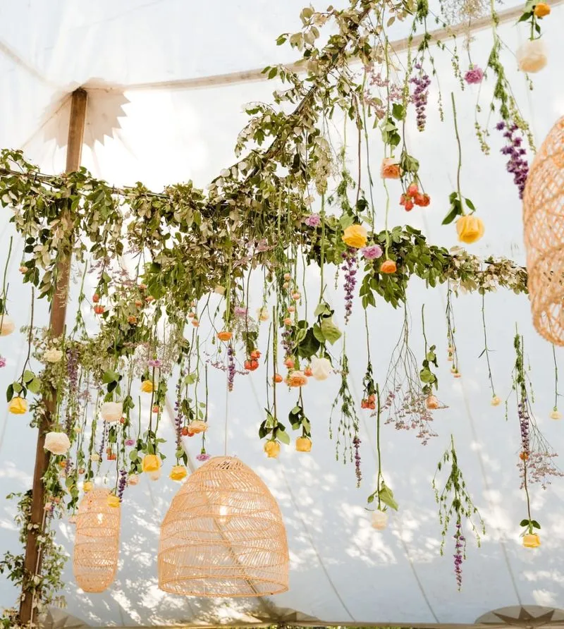
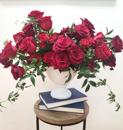
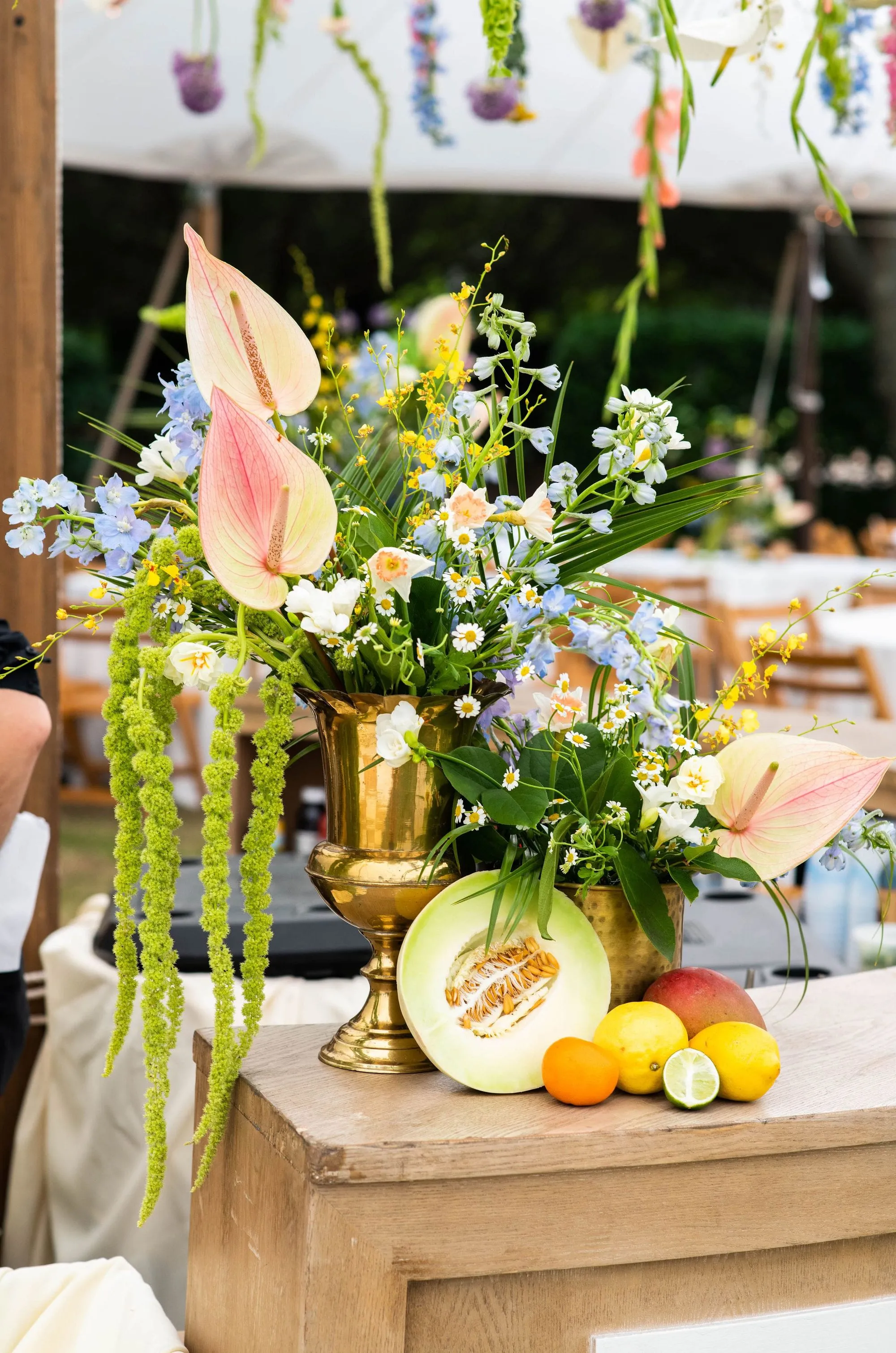
Photography
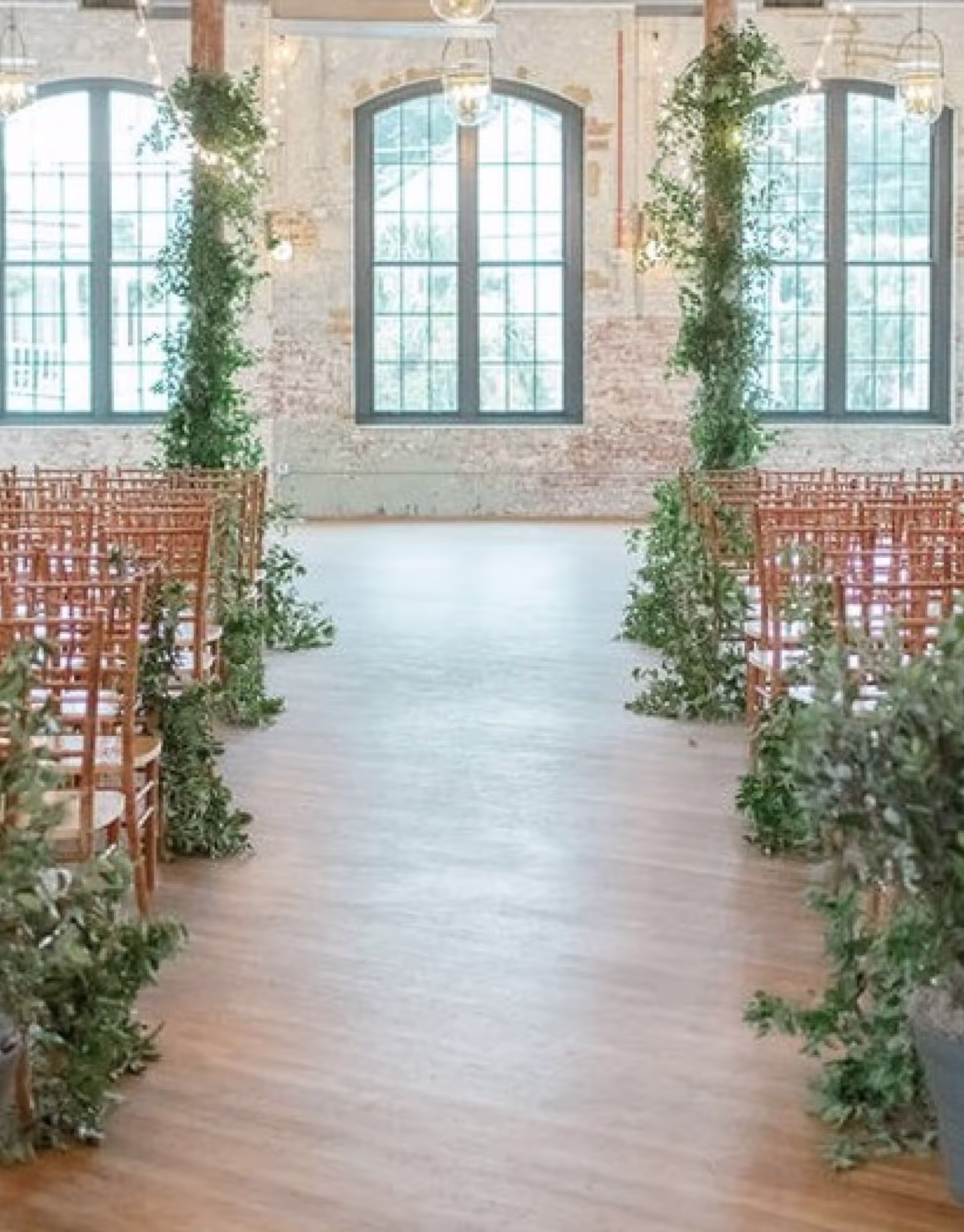
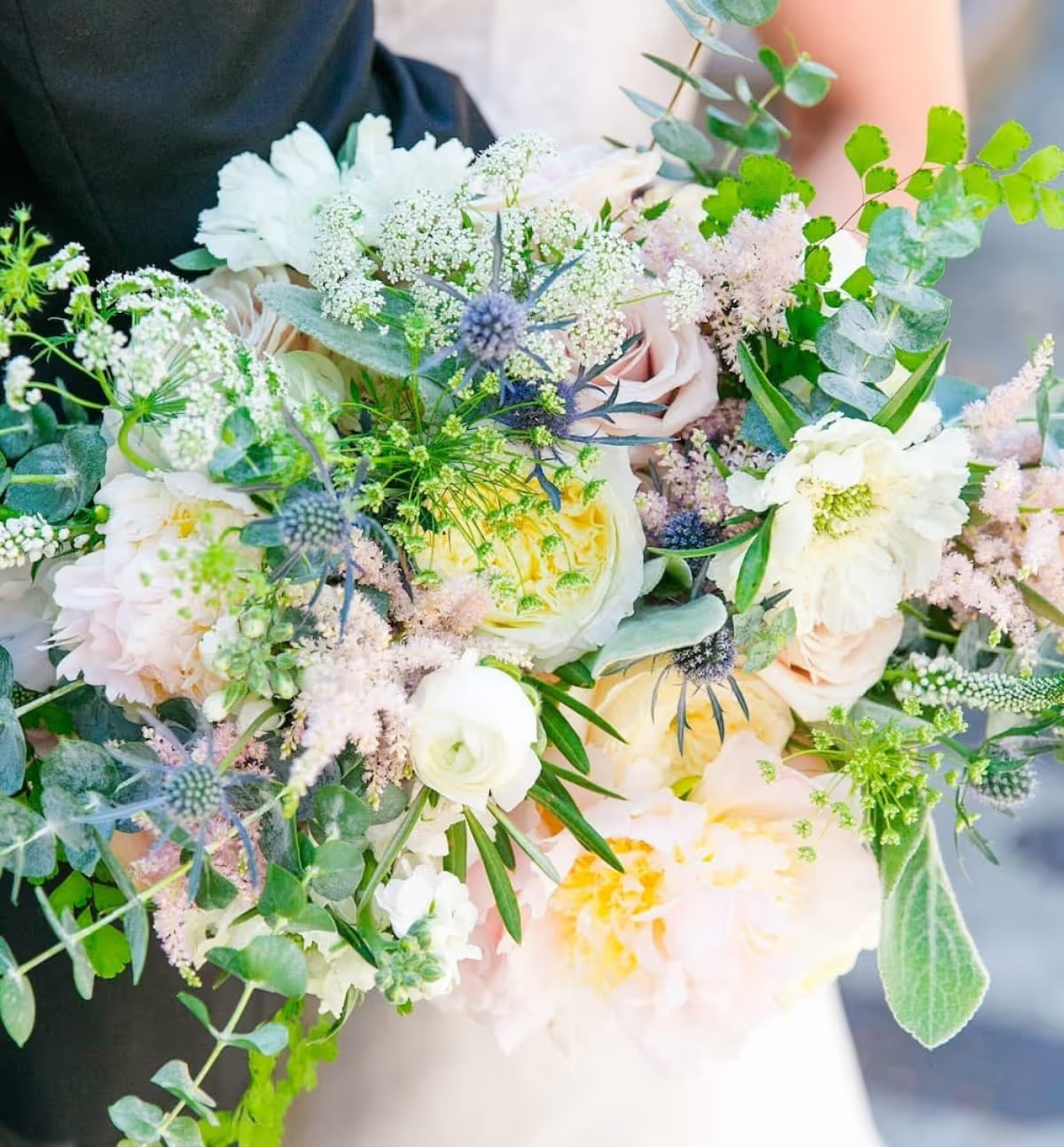
The photography style for our brand is straightforward.
- Quality photos from the shop or weddings/events
- Photos are edited to match style
- Photos show up in a variety of shapes on the site
- For e-commerce products, the product is in a curated setting that features the product and matches the overall website.
Marketing Site Style Image (Arch)
Marketing Site Style Image (Circle)
Marketing Site Style Image (Rounded Sides)
Product Image Style
Messaging
Flower shop and wedding florist in Charleston, SC
Planning a romantic wedding in Charleston? Need a stunning flower arrangement delivered? Or simply treating yourself to beautiful blooms and local gifts? Whatever the occasion, we're thrilled to help tell your story with flowers!